
Notification
Função
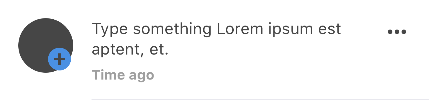
Molécula que virá em lista e notificará o usuário, guandando assim as movimentações e avisos. A notificação poderá ter ações através do "more".
Estrutura Básica
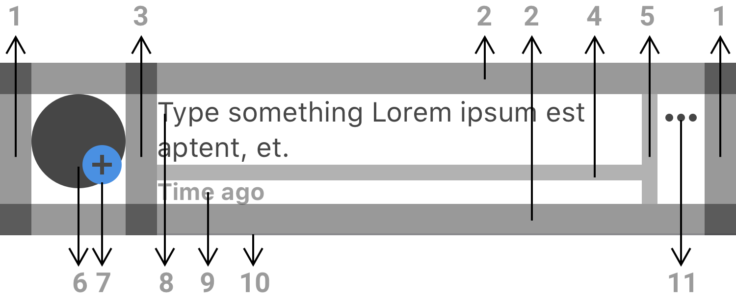
Espaçamentos
- horizontalMargin, como Margem Lateral
- verticalMargin, como Margens Superior e Inferior.
- horizontalPadding, como Espaçamento Horizontal
- VerticalSpace"sizeName" (token)
- VerticalSpace"SizeName" (token)
Átomos
- Avatar
- Icon
- Label TextBodyNotification
- Label com função Time Stamp
- Divisor
- Icon
| Prop | Token | Default Value | Use |
|---|---|---|---|
| Margin | HorizontalSpaceMargin | 16 | 1 |
| VerticalSpace"sizeName" | 16 | 2 | |
| HorizontalSpace"sizeName" | 16 | 3 | |
| VerticalSpace"sizeName" | 8 | 4 | |
| HorizontalSpace"SizeName" | 8 | 5 | |
| Avatar | 48x48 | 6 | |
| Icon | 24X24 | 7, 11 | |
| Label TextBodyNotification | 14/18, regular, FontFamilyProject, ColorDarkGrey, TextAligmentLeft | 8 | |
| Label com função Time Stamp | 12/12, Bold, FontFamilyProject, ColorLightGrey, TextAligmentLeft | 9 | |
| Divisor | Tamanho 1, cor: #E8E8EE | 10 | |
| BackgroundColorMolecule | FFFFFF 0% opacity |
Reações
Responsividade
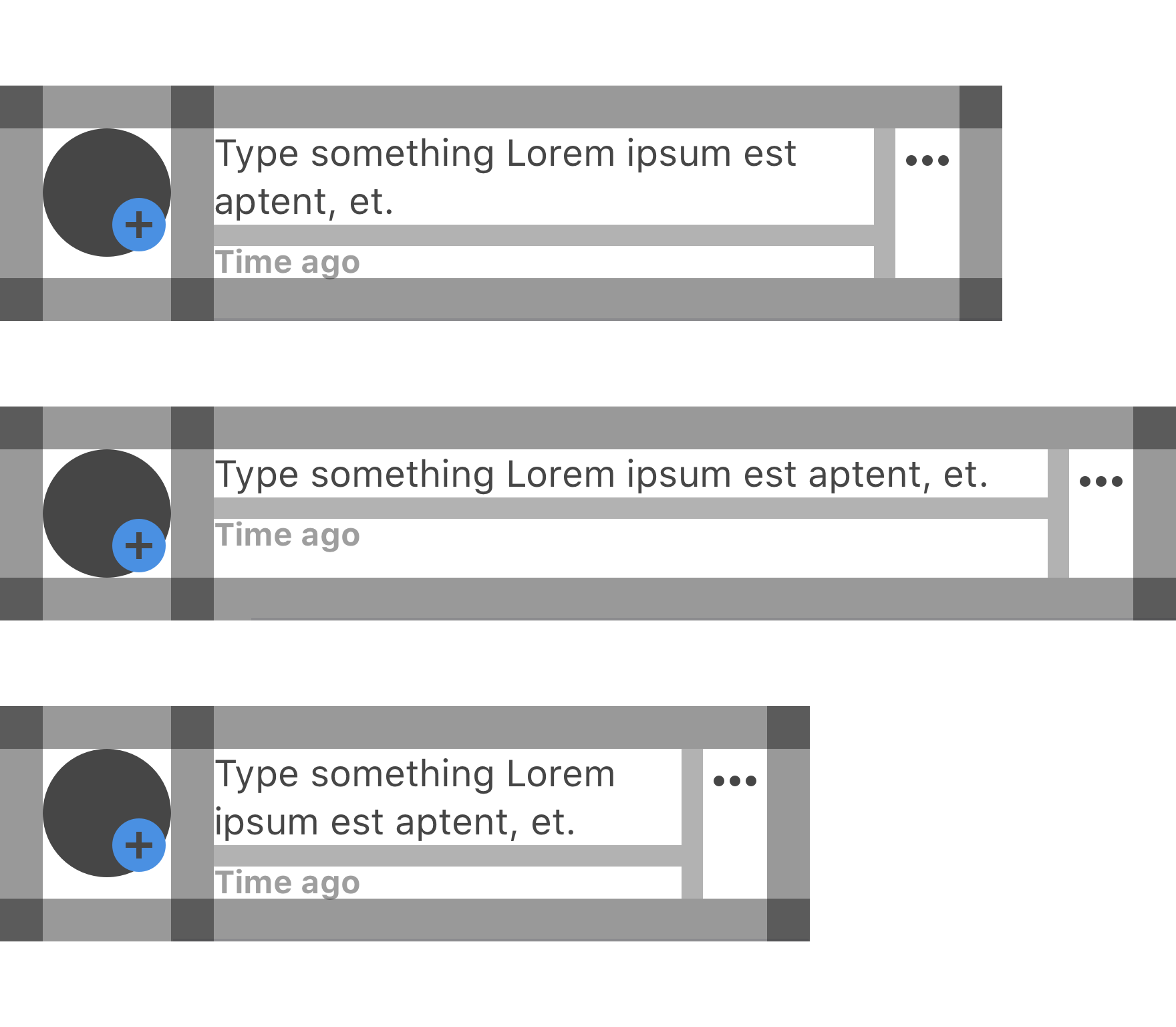
Quando se reduz ou cresce o tamanho da tela, a molécula irá se adaptar conforme a imagem acima. Os espaçamentos são mantidos e o que cresce ou diminui são os 2 campos de texto alinhados à esquerda.
Conteúdo
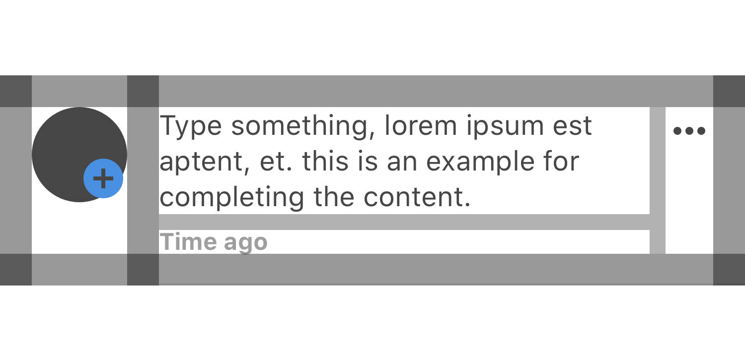
Quando o conteúdo cresce quebra linha conforme a imagem acima, repare que o Avatar(à esquerda) e o button icon (à direita) sem mantem alinhado com a parte de cima do Label TextBodyNotification.
Estados
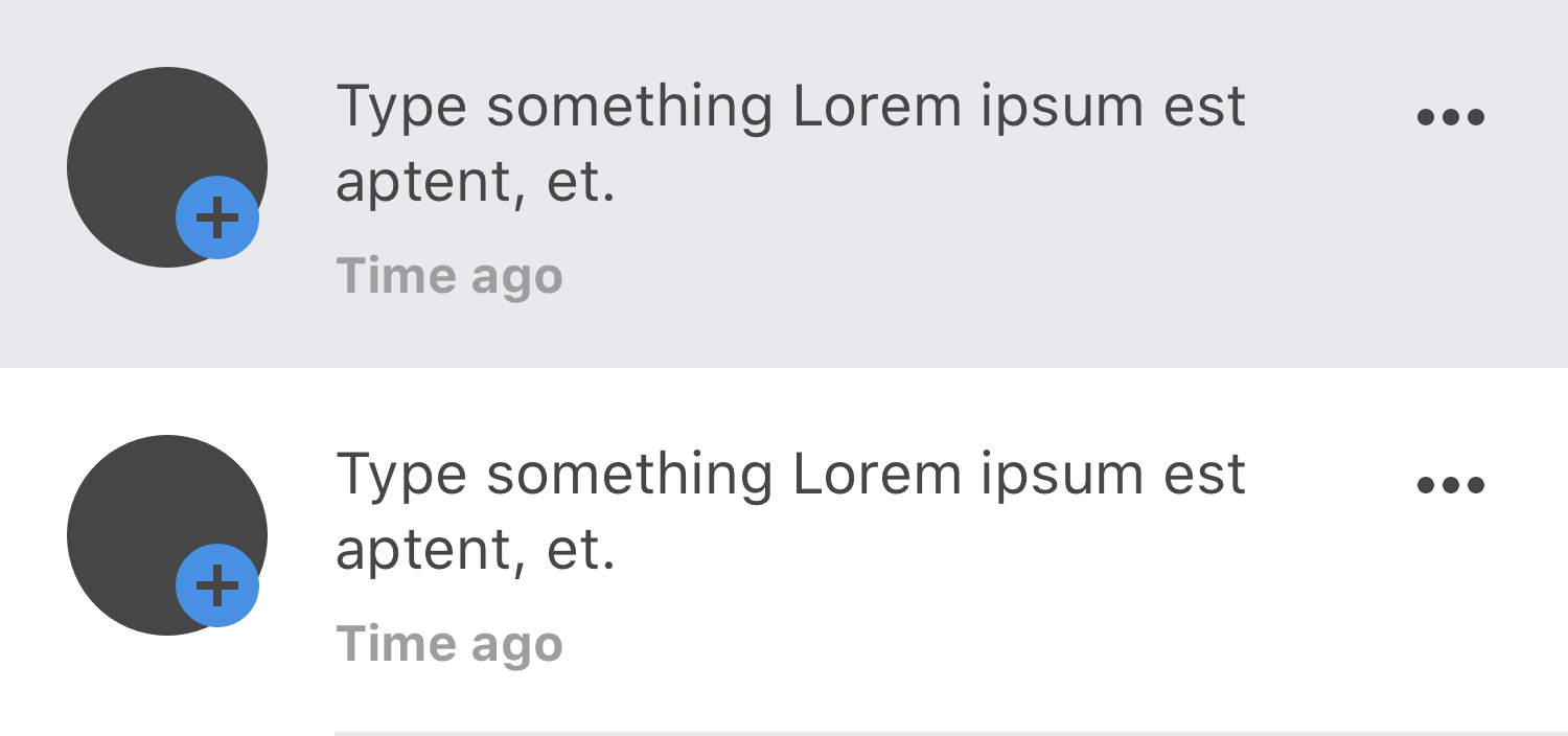
- Não visto: Quando o usuário abre a tela de notificações (onde essas moléculas estarão em lista) a notificação nova terá uma cor de background para indicar ao usuário o que tem de novo.
| Prop | Token | Default Value | Use |
|---|---|---|---|
| BackgroundColorMolecule | #E8E8EE |
- Visto: Notificação já vista pelo usuário.
| Prop | Token | Default Value | Use |
|---|---|---|---|
| BackgroundColorMolecule | #FFFFFF 0% opacity |
Variações/Tipos
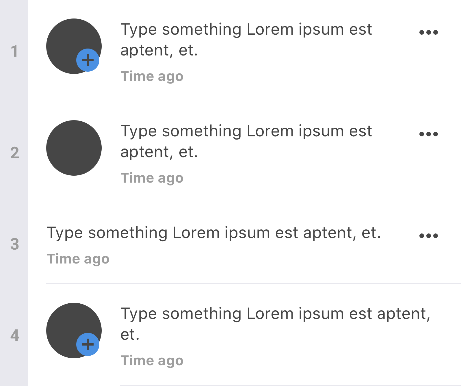
- Sem Divisor
| Prop | Token | Default Value | Use |
|---|---|---|---|
- Sem ícone descritivo
| Prop | Token | Default Value | Use |
|---|---|---|---|
- Sem Avatar
| Prop | Token | Default Value | Use |
|---|---|---|---|
- Sem IconButton
| Prop | Token | Default Value | Use |
|---|---|---|---|